LOL but why though. What in the world compelled you to think… ya know what… I want to try THAT
I mean, I could really care less about how they look lol, if they preform that is. Going with a design like that can yield great results, by giving you a more speaker like experience is the main benefit with a free floating design. The abyss that rice posted is actually somewhat similar in premises that it rests on your head and actually isn’t supposed to make a seal on your head, just barely float above your ears (which is why they went with that design is my guess, also most likely to make something distinctive too). I mean if I see something like that I’m going to want to try it lol
4 Likes
I was waiting for the Jeklin float to pop up
One day I’ll have those.
These are my profile pic too, lol.
As Zeos famously said, “I like cats and anime girls”. 
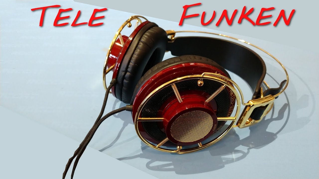
Agreed it doesn’t get much uglier:

1 Like

I actually really like the look of the k1000 but that’s probably my akg/audiophile side of me talking cause it’s such a classic
I feel like if verums had better headband design and was maybe bigger it would be alright
I think that has been addressed by the Verum mk2, as I think that one looks fine.
1 Like
idk, every time i look at these headphones i think “Frankenstein”
I can agree on the verum. I honestly really like their design outside of the crown like band on top. I think the design is a little better imo on mk2 for the ear cup… same band tho unfortunately
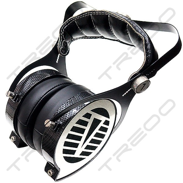
Not the best picture but the carbon fiber + metal version doesn’t look bad.
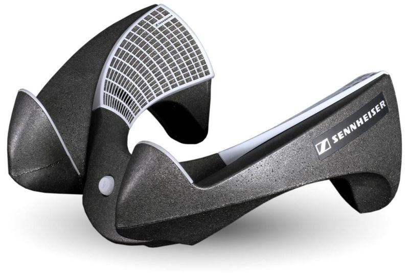
Otherwise I feel like the ukrainian Verum guy is always going for the “headphones in your grandmothers house” look. ![]()

the focal style yoke makes it look way better
agreed on that. They really look nice
![]()
5 Likes