Has anyone who have heard the 1990’s listened to a pair of Grado SR325e? I know its a weird comparison to make but from what people are describing and listening to my SR325e, the overall signature is not that far off.
Have the SR225e and used to own the 1990 and they are two very different headphones.
What’s the main difference(s) you would say?
The 1990 has significantly better bass, imaging, soundstage, and high end. The grados are a bit sweeter and warmer sounding, but the 1990 is aggressive and more intense. Also I like the build better overall on the 1990. I would choose the 1990 over the grados 9 out of 10 times (if i wanted to relax I would use grados)
1 Like
Just won it on auction. Lol
1 Like
FYI: here are the frequency responses of the two compared:
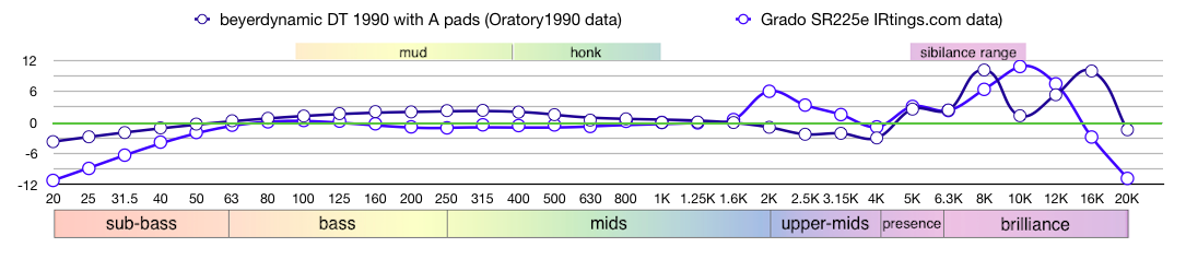
This is with the analytical pads on the 1990. The balanced pads bring up the bass significantly.
(Have no idea whether anyone actually wants visual/objective as well as verbal description, but I’m still having fun playing with my new toy. Plus, a certain forum member suggested some presentation changes that I want to show off.)
2 Likes
Yeah so some people find the 1990 sibilant because of the 8k bump, but you shouldn’t really have any issues if you don’t haven any issues with the grados
Yeah I was about to say that. If you can handle Grado’s 2K then you can handle anything.
1 Like
What are you using to generate those charts? Also it would be preferable to use measurements from a single source rather than two different ones.
I’m using the spreadsheet that comes with MacOS called Numbers. Would love to use a single source but often the same source hasn’t measured the headphones in question.
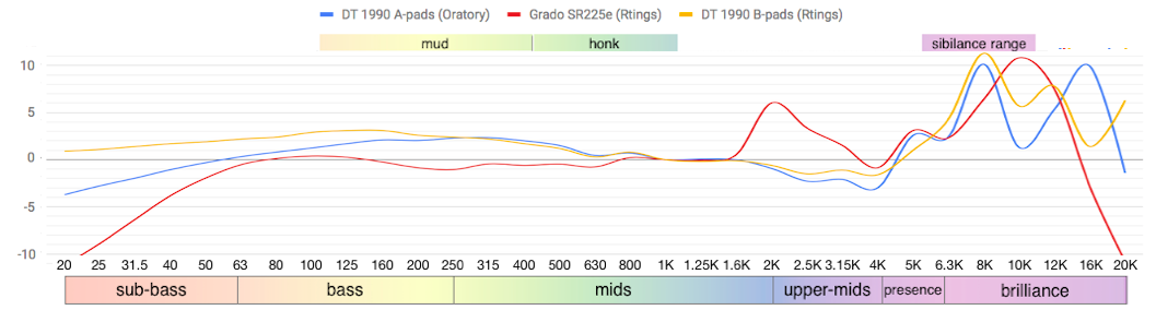
In this case I could use the Rtings data for the 1990 with balanced pads to match the Grado measurements being from Rtings. Does that sound better?
Okay so you’ve configured these plots yourself. It seemed like something could have been generated by a website. You’re not manually inputting the numbers are you? The AutoEQ Github page contains the raw data for most headphones. Also I’d suggest you remove the data point circles and choose two colors that contrast better. But that’s just a personal preference.
1 Like
I kinda like the point circles because it’s almost like a graph that people with only basic knowledge could understand and possibly use for eq if they wanted something of an easy change. IMO if you would want a more detailed graph, grab one from the data source itself, but I kinda like the simplistic format. Also it seems that he is limited to 31 points of data, so it’s not a super high resolution graph anyway
1 Like
Yes, the AutoEQ data are what I use. At present I copy/paste each measurement value into the appropriate cell of a spreadsheet. That was good enough for the EQ work I mainly use these data for.
Sure, I’d love for the spreadsheet graphing module to give me more control. I can’t change the Y-axis values, I can’t get rid of the data point circles. At least I can use any colours anyone wants. It might even be possible to do an import of all 600+ AutoEQ data values for each headphone into a spreadsheet, but those infernal data point circles would making graphing that useless. So would need a real, grown-up plotting application. Looked around but nothing jumped out as doing the job on MacOS.
But the more fundamental question is whether these graphs — or some more sophisticated version of them — is of any use to the forum. People ask for verbal sound descriptions, not graphical ones, to guide their purchase decisions.
I’ve done a few trial balloons now, first with raw graphs, now with compensated, to see if there would be any uptake on the idea of supplementing verbal descriptions with graphical. Nope. So enhancements would be just so much lipstick on a pig. 
Some people find the response graphs useful (including myself). Though people new to the subject probably won’t find them helpful. I’m surprised to hear Apple’s graph software is so limited. If you ever decide you want something better, MS Excel is probably the best thing out there. If you want to use something free, Libre Office would also work.
1 Like
It is hard to beat Excel for spreadsheets. I haven’t used libre office since the Google suite came out. Perhaps look into Google sheets (also free)
1 Like
Excel seems to be subscription only – something I try to avoid. Google sheets doesn’t have a lot of customization, however it does have a no-point-circles option.
Here’s a sample:
This lipstick any better?
I personally like the points because it’s something different, but that’s just me
Edit: actually either are nice, so I don’t really see any issue
I suspect that’s actually the main problem with the points – no other FR graph anyone ever sees has them. So what are they doing there?
IAC, I can do either type now. If anyone actually wants one, whether to illustrate a point or for their own personal interest, just use the forum PM thing to contact me. Happy to cook them up. And likely with fast turn-around.
To recap:
- Upside: they’re built from pro-level HATS/GRAS measurements
- Downside: they’re coarse 1/3 octave smoothed …
- Upside: … but that might make it easier for the novice to see bigger issues vs minor details
- Downside: they’re made via manual input so potential exists for user errror
- Upside: they have a colourful legend that might be helpful to the novice
- Upside: they could potentially offer a consistent, familiar presentation from one forum post to another post
- Downside: like any other measurement graph they give no indication of underlying data issues like unit-to-unit variance or differences in measurement gear and operator variance (no error bars).
Just crossed a few downsides off the list. Figured out how to import the full AutoEQ data for any headphone into the Google spreadsheet. No more 31 data point limitation, no more manual data input.
Here’s an example putting the new methodology to work. And I know it’s one you’ve all been dying to see, the M40x and M50x compared via Oratory1990 data:
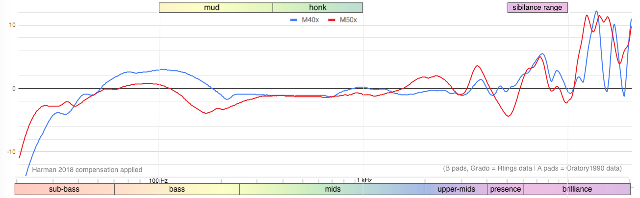
Was Zeos a secret Harman Target junkie a few years back? The M40x arguably comes closer to Harman than the M50x does, at least according to this graph. And he swore true yellow and black allegiance to the HD 600 back then, as well. Those were the days… And yet we see the beginnings of an incipient bass head emerging in the M40x data, as well. See how useful FR graphs can be?
IAC, hope this allays a few concerns. Hope the pig looks a little better with less lipstick.
1 Like
What if you also added a banner above 2.5k to 5k as potentially fatiguing range
Or 1k to 2.5k as commonly “gritty” or grit sound range
But that might be getting too much
Also you could potentially add “range” after honk and mud so they say mud range or honk range
And the graph you posted still says grado and 1990 in the bottom right corner just to let you know
Overall I think it looks better, and is pretty simple. I just think it needs more detailed indication like a 2k, 3k, 4k marker, etc.
1 Like