There was a ton of texts explaining the differences between the graphs online… Yeah, texts explaining graphs… hmm… Here’s something simpler: “All the graphs!”
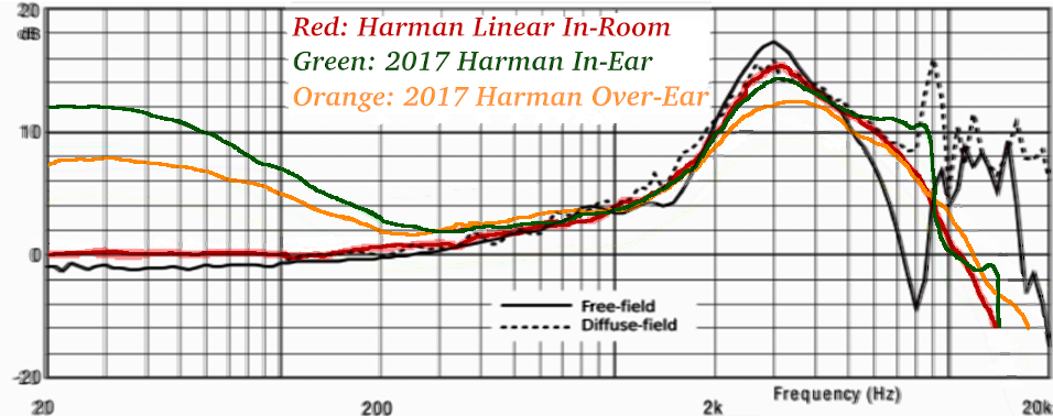
Harman tries to find, more or less, the industry standard of “what sounds natural”. Warning: This does not means it’s your standard.
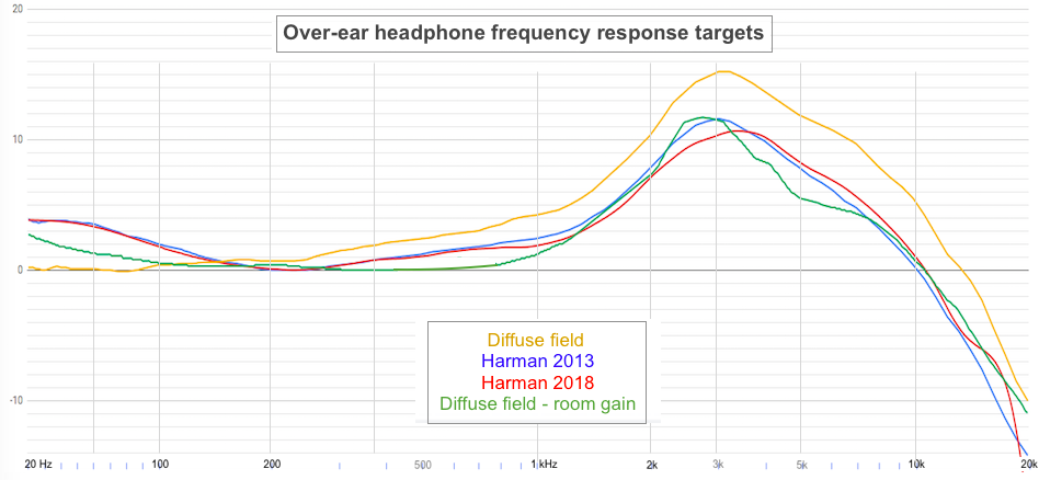
Crinacle apparently doesn’t compensate his graphs. So, if you want something natural-sounding, for In-Ears, you’ll have to search for something that looks like the green line. For headphones, the orange line.
Mass/Drop are fans of the Diffuse-Field curve, that’s the dotted line. So, huh, “this earphone/headphone looks neutral” on Drop, means, more or less +5dB for cymbals and “esses”, and -5dB to -10dB bass.
Finally, for the red line, it’s speakers, equalized to be flat in an anechoic room, measured at the ear drum.
Sources: Research Gate for the free-field and diffuse-field frequency responses measured with HATS. Inner Fidelity for the In-Ear and Over-Ear Harman curves.
And some guy on reddit for the red, Harman Linear In-Room (speakers) curve… but Inner Fidelity got it too (phew!).
I love to see anything related to headphone graphs. I feel so all alone on this forum most of the time, grin.
Absolutely Crinacle’s graphs are raw. But as I’ve pointed out elsewhere he allows you to use one headphone to compensate another, which I think is pretty darned cool.
Sean Olive at Harman explains the high frequency cut-off as being a limitation they had in the experiment/testing process. The Harman target beyond the 15k is simply undefined.
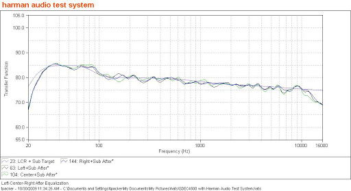
And thanks to you for finding that diffuse field dotted line graph. I’ve been looking for it for months. Does anyone know who produced it and whether it supersedes the Hammershoi and Moeller version from 2008?
I ask because the 9k peak is very intriguing. Presumably it’s the 2nd ear canal resonance of the ISO(?) standard ear canal. But beyerdynamic gets crap for doing just that in their headphone response curves, grin.
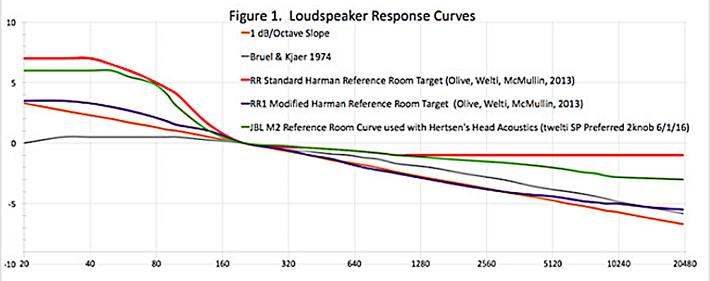
What? No, there’s no way. That’s still a headphone curve, that’s why it has a big hump. A perfect speaker curve is perfectly flat if measured in free field (anechoic chamber) or tilted in favor of bass by 1 dB/octave if measured in a listening room.
To be clear:
The red curve is not something you can use when buying speakers because it’s measured with a HATS/GRAS/whatever, like headphones, and nobody’s gonna give you this kind of curve for speakers. They measure speakers with free-standing microphones.
It’s not raw, it’s modified through bass removal because Olive&Welti were preparing it for a listening experiment. There’s no use for it in practice (unless maybe you’re trying to replicate O&W’s experiment).
The red curve is the ear drum response after the speakers in the Harman listening room have been EQ’d to remove room effects. It essentially matches the H&M DF curve and is there for comparison (and validation?). The same speakers would measure flat in an anechoic chamber as abm0 states.
Here are the Harman reference room measurement targets:
Notice the red-orange line (RR Standard). That huge bass hump is how they have their reference listening room tuned. When developing a loudspeakers for the home market, this is what they are shooting for. Their consumer research (directed by the famous Floyd Toole, I believe) for loudspeakers clearly showed that boosted bass sells. Their headphone research (directed by Sean Olive, a Floyd Toole student) was to find out whether this would transfer over from loudspeakers to headphones. (Clearly, it did.)
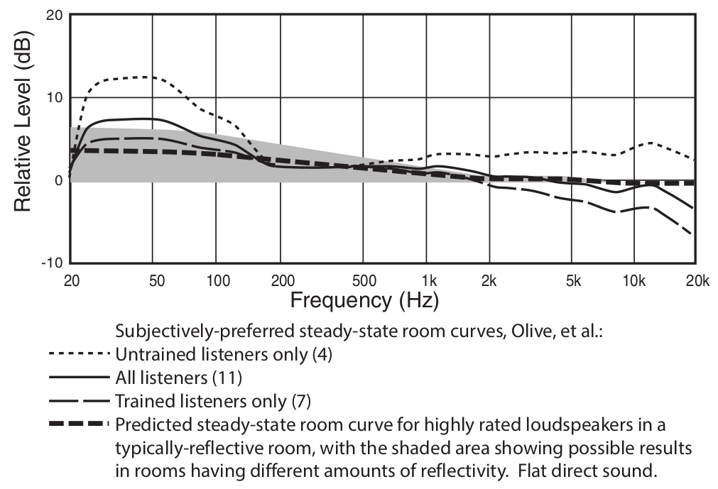
Yeah but, lol, that’s definitely not natural-sounding. I also found this (Yup, it’s from “The Measurement and Calibration of Sound Reproducing Systems”, by Floyd E. Toole).
Look at the difference between, let’s say, the “Beats” crowd versus the “Trained listeners only”.
Does anyone know where I can find the raw data points for the Harman Curve? I’ve been having a remarkably difficult time trying to find them. Having them would be useful for a side project I’m working on.
You’ll quickly discover that the data are linear below 100 Hz and logarithmic above. If you ever find a way to generate the missing logarithmic values below 100 Hz, I’d love to know about it.
I open harman_over-ear_2018.csv. The integer frequency numbers from 20 to 100 are all present in the frequency column. But after 102 frequency numbers are gradually skipped. For example, there is no 103 or 116. By the time you get up to the kilohertz range the gaps are about 10 hertz wide, and keep getting larger.
But for the samples to be logarithmic below 100, apparently there would need to be fractional-hertz sampling. Upshot: when I tell the spreadsheet to plot the raw column the curve is radically foreshortened below 100 hertz. For example:
The range from 20 to 100 Hz occupies roughly the same width as the range from 100 to 200 Hz. But the parallel ranges from 200 to 1000 Hz or 2000 to 10,000 Hz are much wider.
My original question is if you need to logarithm-atize (so to speak) the 20 to 100 Hz range yourself I’d love to learn how it’s done. But certainly don’t labour over it otherwise.
Okay so the spacing between 20 Hz to 100 Hz is not correct. I think that’s an issue with your graph software. Is the chart type set to scatter plot? Is your program automatically guessing how the x axis should be configured? Maybe you need to manually configure a setting?
I’m using MS Excel and that’s not an issue I’m having.
Thanks! I’m using the on-line Google Docs spreadsheet as recommended by someone on the forum in place of the free spreadsheet that came with my MacBook. Neither seems to have sufficient configuration options to force a particular x-axis type. Not surprising that I would need to buy a full-featured product to get results like your example.
When do graphs matter? I’m guessing for audio manufactures that try and please most of the people all of the time?..we as audiophiles trust our ears and chosen source end device combinations no?
