I would add Softears to that, at least the Twilight. It looks classy but understated, no nonsense.
2 Likes
I guess this is another one of those things that will never be one answer to![]() . I like the Penon/ISN standard packaging, but also Dunu, Hisenior and the other mentioned. But the truth is a use just the IEM’s and cable 99% of the time. The other accessories stay in the box stored away
. I like the Penon/ISN standard packaging, but also Dunu, Hisenior and the other mentioned. But the truth is a use just the IEM’s and cable 99% of the time. The other accessories stay in the box stored away![]()
6 Likes
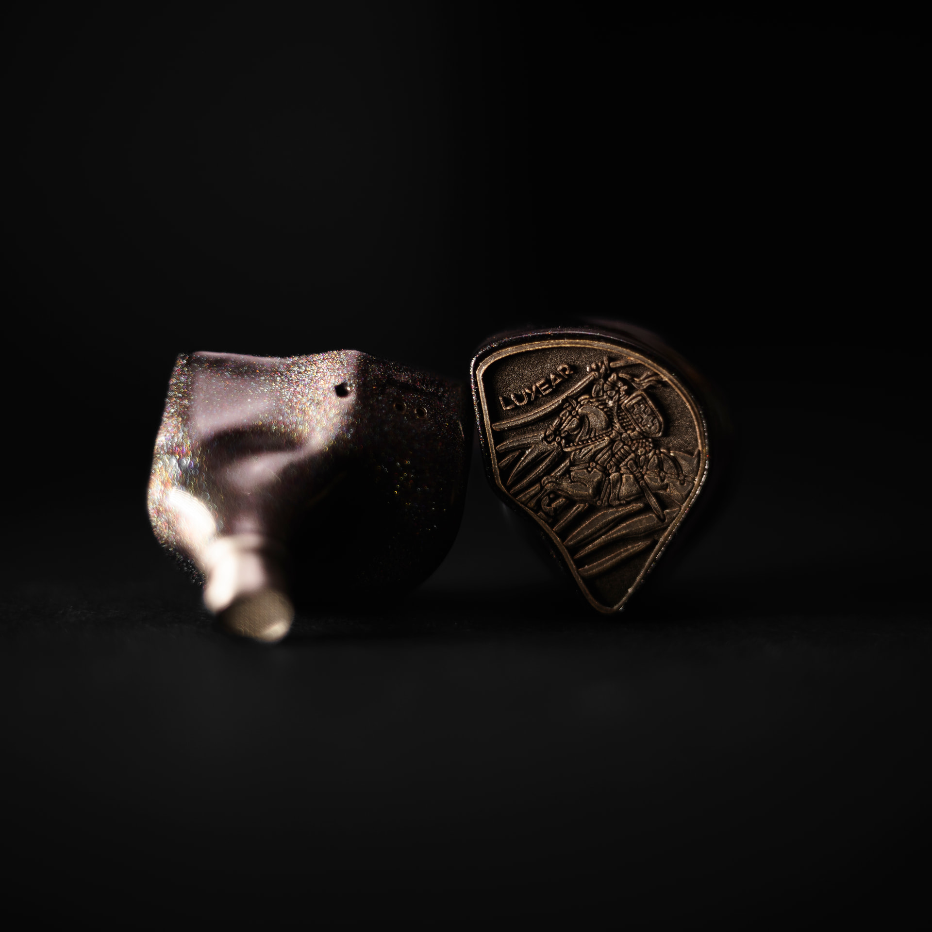
Hi everyone, I’ve posted a full review of the Luxear Valors over on Head-Fi. If anyone would like to have a quick read, I would appreciate any and all support! Even if you just read it, that would make my day.
https://www.head-fi.org/showcase/luxear-valor.28973/reviews
These are incredibly expensive IEMs at just under $4,000 USD…. but, god damn are they fantastic. Seriously had a great experience with them, and if I were to spend the cash on these, I would genuinely be very happy. The dynamics are to die for.
Thanks for reading ![]()


13 Likes
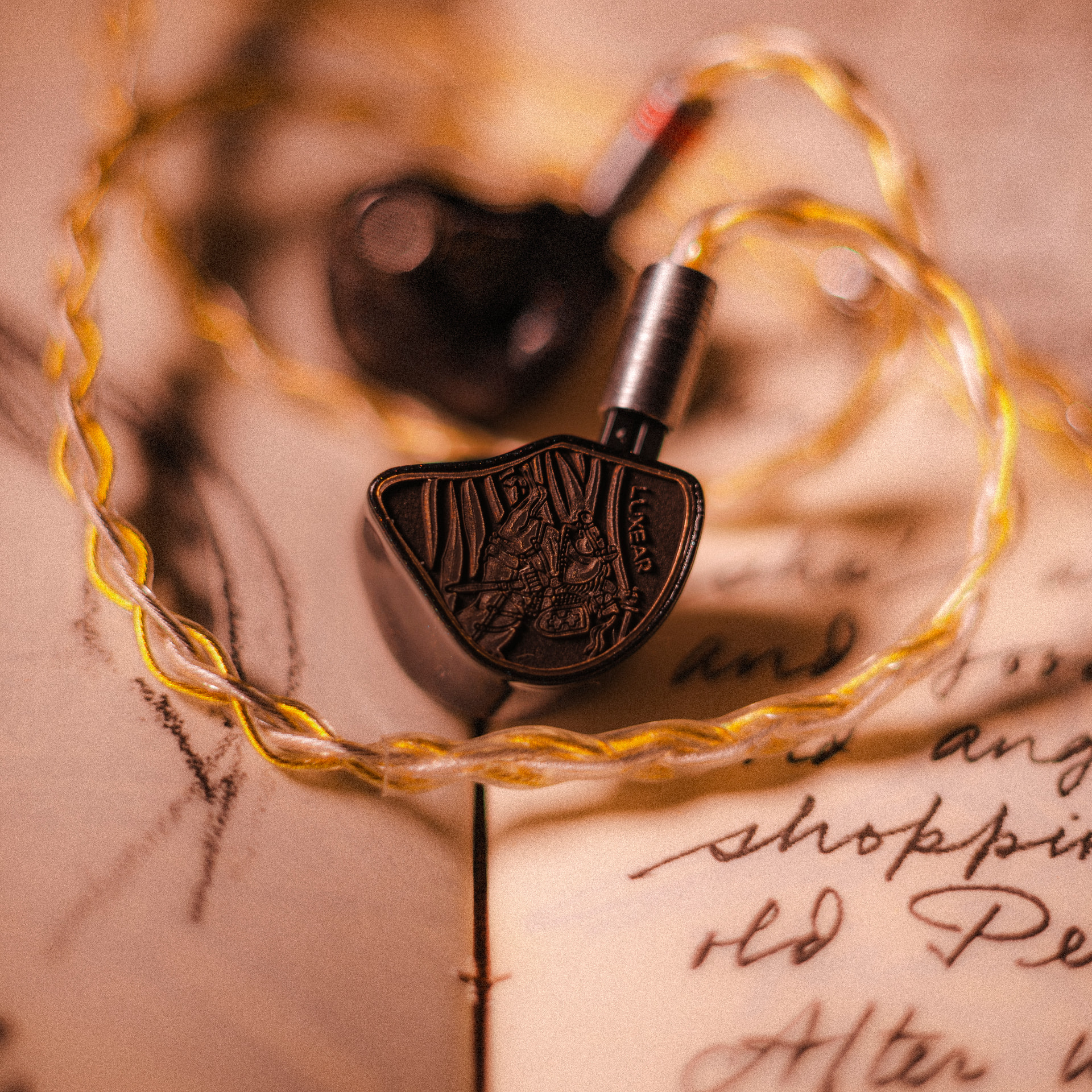
God damn, back with another review. This time it’s on the new kid on the block, the Prisma Lux.
https://www.head-fi.org/showcase/prisma-lux.29013/reviews
They’re not ‘affordable’ in any sense of that word, but I would say they’re priced perfectly and are worth their $1300 asking price. In my opinion, they’re one of the best IEMs I’ve heard.
Thanks to @Sonofholhorse for making this happen ![]()


11 Likes
Love the extensive writeup. You really make the effort to get your experience across which is, as we all know, not easy (especially if you’re trying to explain why a 1000+ set is better, or rather how it is better, than a 100+ one) given the limited vocabulary one needs to work with. Makes me regret not giving them a try last CanJam London.
5 Likes
I really did give my all for this review. Josh deserved a proper and detailed write-up for sure.
I bet you or anyone could, honestly. I’m not the best at it, but I do find it satisfying. Especially if it’s at all helpful for a smaller company, but it doesn’t look like Josh needs any more publicity. I think he’s already overrun with orders.
Anyways, thanks so much for reading, and I do appreciate your compliments ![]()
5 Likes
Good impressions, Dom!
You mentioned that the upper treble is similar with the Meteor. This is now on my radar, I have been looking for IEMs that presents the same or better upper treble energy like the Meteors and this might be it!
4 Likes
I would say, sauce-wise, the upper treble has that Meteor magic for sure.
Josh got an influx of orders in recently, so the wait list is going to be insane for sure. Better get on there soon.
4 Likes
Good to know! I read somewhere that Symphonium Zenith may have aggressive upper treble as well. I may wait for some impressions and see who does upper better. ![]()
2 Likes
Really? Man, I did not find the upper treble in the Zenith at all aggresive but hey, I enjoy some extra shimmer up top, so that could be why.
I hope to get maybe a Demo unit in the future, but we shall see ![]()
3 Likes


I had no idea they were $1300. (Whoops, Lumen not Lux, seems to be simillarly priced though). They were up as the default squig on squig link when I just recently looked up a different IEM and they were really similar (not perfectly) in their curve.
Ah found it in my history. Penon Fan 3

Definitely a different female vocals area and some sharper cymbals, quite a lot in common though overall.
6 Likes
Good catch, John. You’ve always had a keen eye for graphs.
Both the Lux and Lumen are the same price @ $1300, but due to the conversion rate will increase to $1400 iirc.
I never got to hear the Fan 3 tbh but it’s good to know theres a less expensive alt. out there.
2 Likes
That text on the faceplate is awful. Completely ruins a great look.
1 Like
You’re the first person to say that. Interesting… I respect your opinion.
3 Likes
I disagree but it would also be nice to get a text-less option (despite the hassle of multiple glass pieces to stock for Prisma). I think the pics do a big point of highlighting the text on the inserts; at the right angles the text basically disappears. I do think the text ‘pops’ a little more on the black versions than the green/champagne ones though.
1 Like
Guy is right, I should have mentioned that. The text has a more reflective surface so it’s reflecting light on the picture making it jump out more.
3 Likes
Damn, I thought the branding was subtle enough ![]() (this is coming from someone who really doesn’t like bling or obnoxious logos plastered all over things)
(this is coming from someone who really doesn’t like bling or obnoxious logos plastered all over things)
Jokes aside, it’s impossible to please everyone. There are equally as many, if not more people who consider it a boring and uninspired look. But as mentioned earlier, oftentimes the photos aim to highlight the text with favourable lighting reflecting off it, and in real life it’s far more subtle. See left vs right below. Black is admittedly a bit more visible, but in exchange you get a more subtle colour.

9 Likes
Josh on my page. Absolutely honored btw ![]()
4 Likes
I’m always lurking everywhere… muahahahaha
4 Likes