This post is a bit of a detective story that will interest myself and maybe four or five others on the forum. If you sometimes look at frequency response graphs but only have a hazy idea how to read them, suffice it to say this is a cautionary tale on how misleading they can be. For the grisly details read on. I’ve tried to present the relevant information in an easily accessible manner.
The first many of us knew that there was such a thing as a new Audeze LCD-1 was Metal571’s October 16th YouTube review (https://www.youtube.com/watch?v=AabXYdmrqgo&t=1s). He was clearly excited verging on euphoric, and his sound description was on the favourable side for a Metal review.
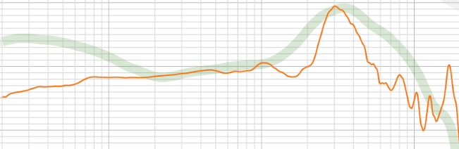
The unrepentant geeks among us went right to the two FR graphs he posted in the description box for the video. He has a Mini-DSP EARS and posted the graph he made using it:
This is a compensated graph (HPN), so in theory a perfect frequency response would show as a straight horizontal line. Any up or down variations should represent imperfections in the tuning. Vertical axis is loudness, horizontal is frequency or pitch. Lows or bass is on the left, mids are in the middle, highs are on the right. The graph says the lowest bass has a sharp drop-off, there is a serious dip between 1 kHz and 3 kHz and another serious dip between 3 kHz and 10 kHz.
Translated this means the bass doesn’t have quite the flat-line extension we expect from the best planars, vocals and many instruments may sound a bit thin in the high end of the mids and the treble should be mostly laid-back, although good in the air region or top octave. However, in his spoken review Metal warns us that he had a hard time getting a good seal when measuring the LCD-1, meaning some or all of the sub-bass dip could be due to that. And beyond all that the sheer jaggedness on the right end of the graph suggests a truly harsh sound in flat contradiction to his oral report.
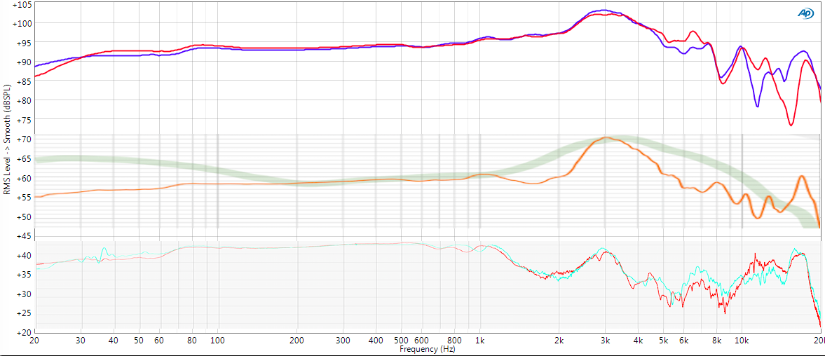
But Metal also attached a frequency response graph sent to him by Audeze, dated from the day before:
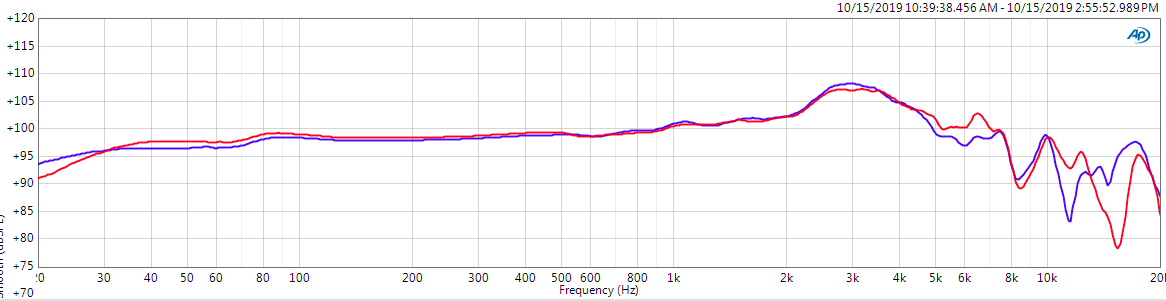
This is an UN-compensated or raw graph, so making sense of it involves some prior knowledge. Overall, this graph has an uncanny resemblance to a typical Head-Fi/Jude graph. The similarity is so strong one can almost imagine Jude or one of his staff having sent it to Audeze, then Audeze in turn passing it on to Metal571. But Metal only states that it comes from Audeze, so we’ll have to leave it at that.
Like a Head-Fi graph, the loudness/vertical axis is foreshortened, the FR/horizontal axis is stretched and it has something like 12th-octave smoothing applied. Metal tells us it was done using GRAS plus Kemar and the graph itself bears the Audio Precision logo. This is some of the latest, greatest and most expensive measurement gear going. The squashed vertical plus the smoothing puts the measurements in the best possible light. The bass fall-off looks nearly non-existent. The 1 to 3 kHz recess is essentially non-existent. Only the jagged treble seems to carry over from Metal’s graph – and that’s something we tend to take for granted.
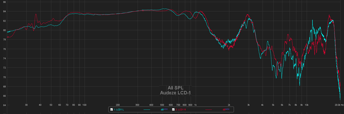
The above, plus a few early listener reports, were all we had to go on for the first month. Then today I stumbled upon a graph for the LCD-1 from Oratory1990 in his reddit-linked repository, presumably fresh from the oven. Oratory also uses the latest and greatest measurement equipment and presumably has no horse in the race, so what does he have to tell us?
Both are raw, but it’s hard to imagine anything more different to the eye from the Audeze raw graph above. The gentle knoll topping out at 3 kHz in the Audeze graph looks like an impossible Mt Everest here. Not sure I’ve ever seen anything quite like it elsewhere. The bass, 1-3 kHz, and treble dips Metal’s graph show are all here, but in a much more understandable layout.
Is there any relationship between the Oratory1990 and the Audeze graph?
Here I’ve taken the Oratory and Metal571 graphs, stretched them horizontally and squashed them vertically until they have the same scaling as the Audeze graph. Now what’s most remarkable is how similar they suddenly revealed to be, especially the two raw graphs on top. To my eyes the main difference between the two is that the Audeze graph lacks nearly all the 1 to 3 kHz scoop. Even the compensated EARS graph makes sense if we imagine it tilted upward from 1 to 3 kHz then back downward after that.
All of which should lead us to conclude that we need to beware of the semblance of technical authoritativeness that graphs exude. Even when no active data falsification is involved (presumably a rare to non-existent thing), even when equipment limitations and operator error are a non-issue, presentation remains everything.